Explorite

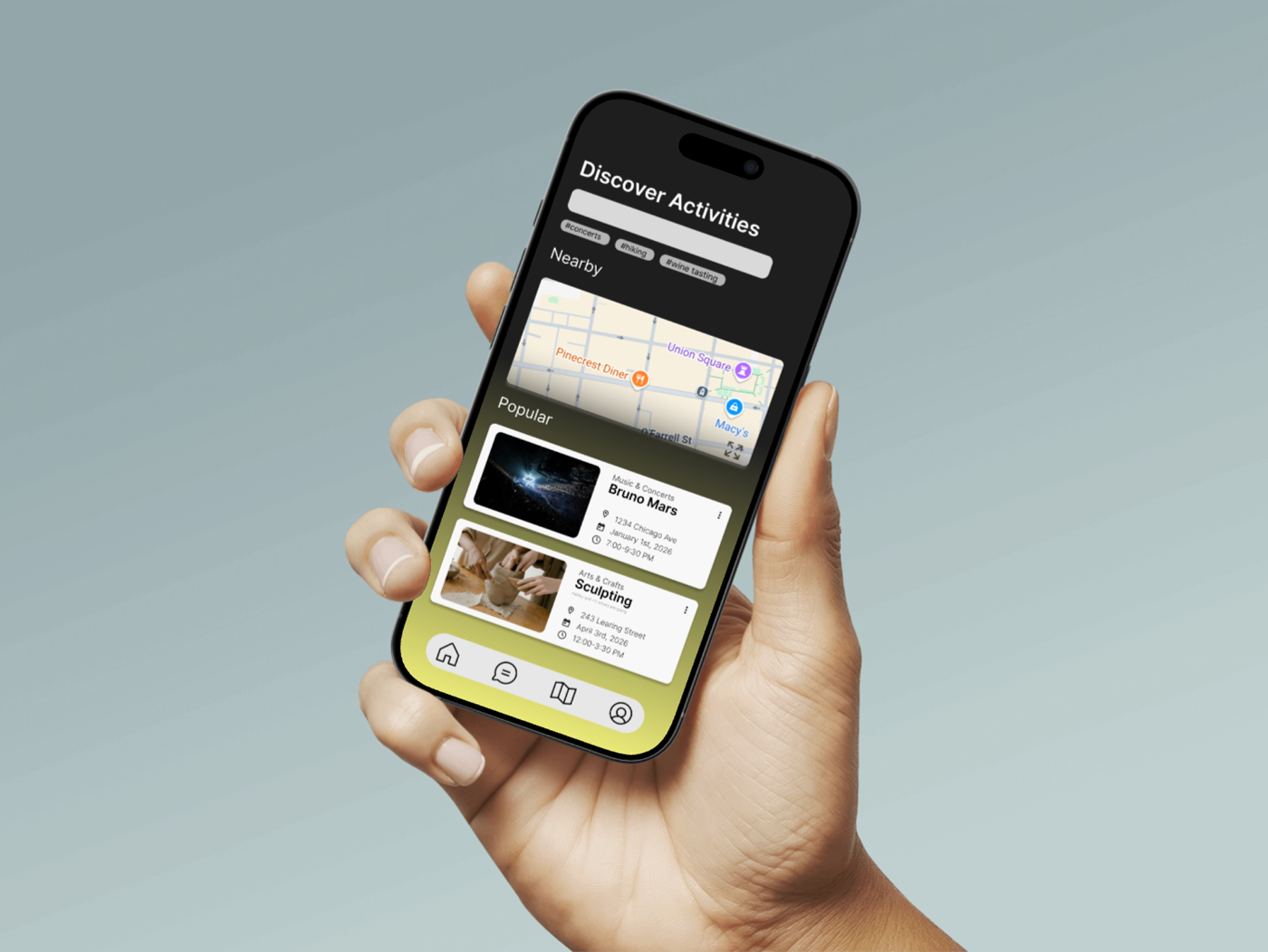
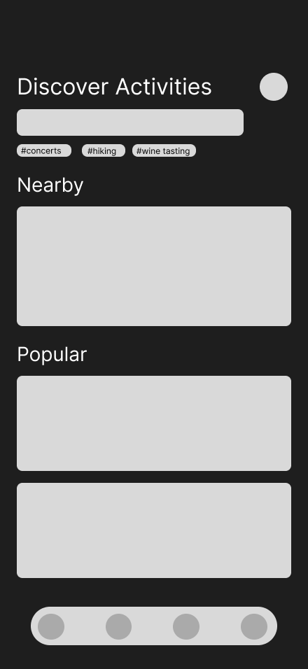
The discover screen, the heart of Explorite, shown on device.
The problem
You land somewhere new, you have two free days, and every option in front of you is either a tourist trap with 40,000 reviews or a listicle written for someone else. Travelers struggle with two things at once: finding good local activities quickly, and trusting what they find. The cost of a bad pick on a short trip is high, so people default to the safe, generic choice and miss the trip they actually wanted.
My role
End-to-end UX designer, solo. Research design, interviews, synthesis, personas, journey mapping, wireframes, and the clickable prototype. This project was about proving I can run the full process, not just produce polished screens. Process is what separates a designer from a decorator.
Process
- Research first. I ran user interviews and recorded them, audio and video, so I could go back to what people actually said instead of what I remembered them saying.
- Synthesis. The raw interviews went through an affinity diagram to surface patterns, an empathy map to capture what users think, feel, say, and do, and a user journey map to locate exactly where the trip-planning experience breaks down.
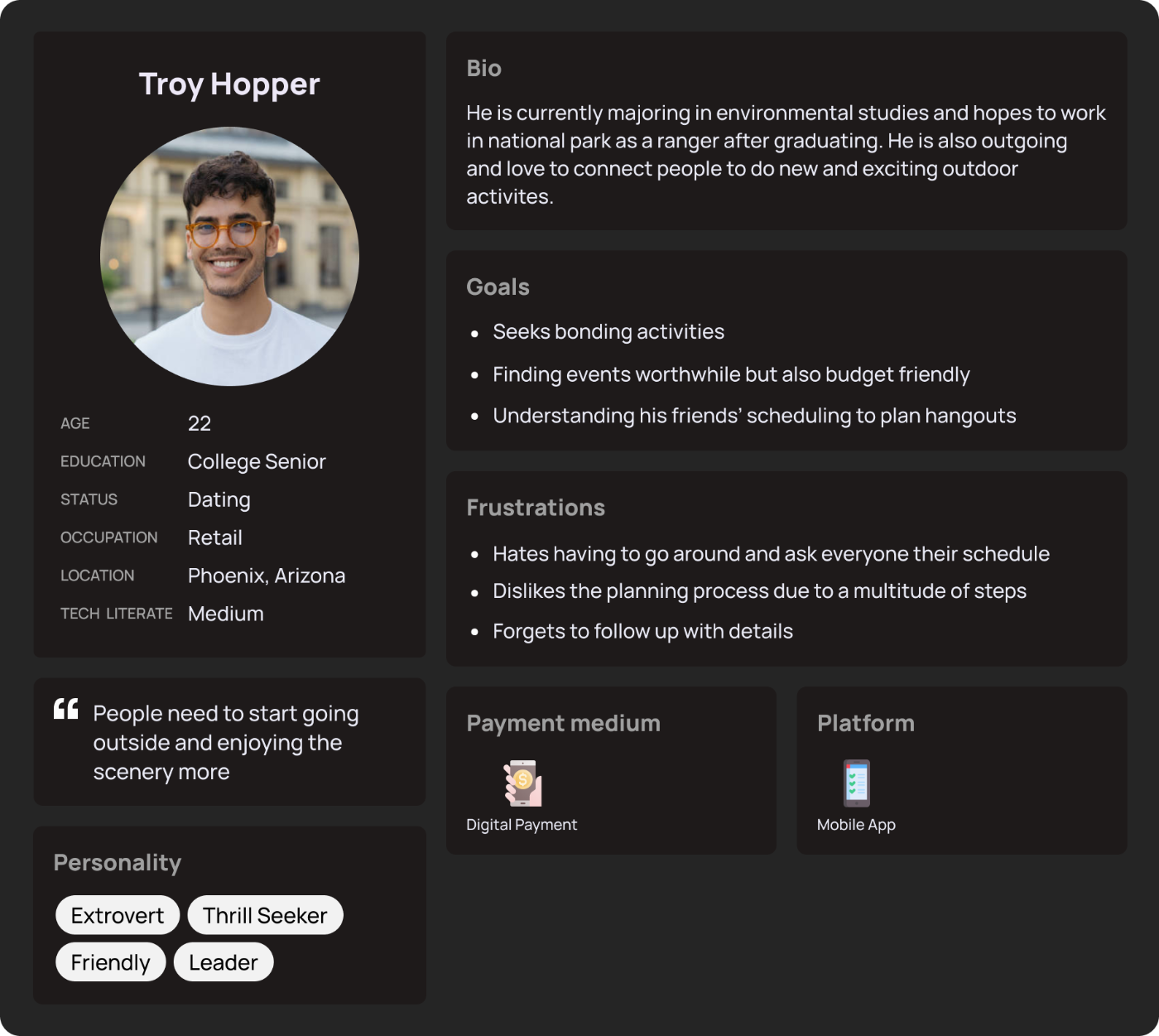
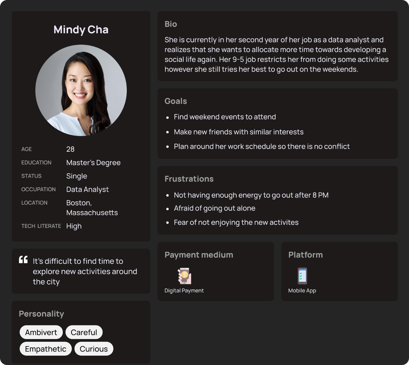
- Personas. Two personas, built from the research rather than invented. They kept every later design decision accountable to a real user type instead of my own preferences.
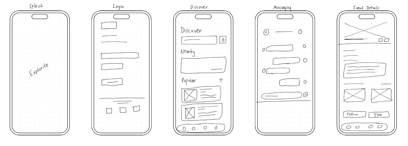
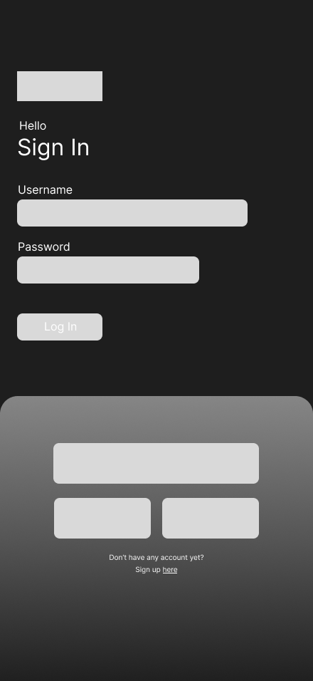
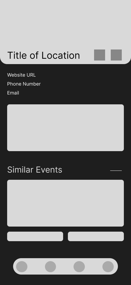
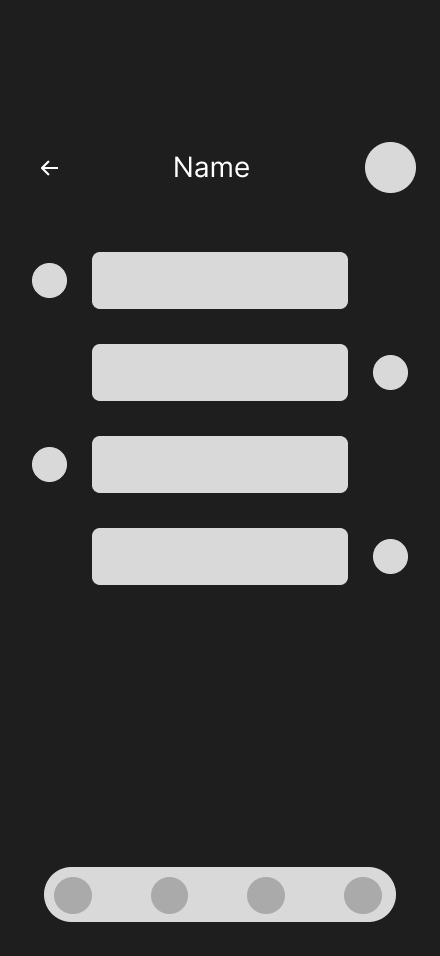
- Design. Wireframe sketches first, then clickable prototypes across six screens: splash, login, discover activities, event details, and messaging. Finished with iPhone 16 Pro mockups to present the work in context.
Key decisions
Prototype the core loop, not the whole app
Six screens is not the full product; it is the spine of it. Discover, evaluate, coordinate. The prototype covers the path a traveler actually walks.
Let the research pick the features
The screens exist because the synthesis pointed at them, not because a competitor had them. Every feature had to trace back to something a participant actually said or did.
Build personas before pixels
Doing the unglamorous middle steps, affinity diagram, empathy map, journey map, meant that by the time I sketched wireframes, the open questions were already answered. The design phase went fast because the research phase was slow.
The core loop, six screens: discover, evaluate, coordinate.

Outcome
A complete research-to-prototype case study: recorded interviews, affinity diagram, empathy map, journey map, two research-based personas, wireframe sketches, a six-screen clickable prototype, and presentation mockups. As a portfolio piece it does exactly what I built it to do: prove the process end to end.
What I’d do next
- Usability-test the prototype with people who match the personas, and let the failures drive a second iteration. Research should not stop when the pixels start.
- Rerun the synthesis with AI as a partner. This project predates my AI-assisted workflow, and it is a perfect benchmark: I would have AI do a first-pass transcript clustering, then check it against my hand-built affinity diagram. Same rigor, a fraction of the hours, and the comparison itself would be worth publishing.
- Pressure-test the trust problem specifically. Discovery is only half the job; I would explore what actually makes a recommendation feel trustworthy to a traveler, because that is the harder and more valuable half.